Navisight


| Thursday, December 13, 2007, 7:45 AM |  |
Home |

Navisight
Support
Availability
|

NavigationBar is one of the core controls in the Navisight suite and presents a switchable, categorized view of other controls. Of the many categories present in a NavigationBar, only one can be "selected" at one time. All categories display clickable headings, and clicking a heading brings that category in to view. Categories are parent controls and can therefore contain any number of children. When switching between categories, NavigationBar applies smooth animation effects. The type of animation loop used and its duration are fully configurable. A quick animation during a category change can add a great level of polish to your application and Navisight does all the work for you. Animation effects are also available programmatically. 
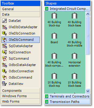
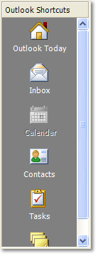
Although categories can host any kind of child control, you will often want to make use of the ButtonBar control. This is provided in the Navisight suite and is the ideal partner for NavigationBar. It is a simple toolbar, with items laid out from top to bottom. Item spacing can be changed, and also the highlighting scope (image and text or image only). The layout of button text around the image can be set to side or underneath. Like most button controls, the buttons in a ButtonBar have an Activate event, and they support checked and disabled states. A choice of three renderers is available for NavigationBar out of the box, which can be extended and customized to the nth degree. The default renderers mimic the visual style of Office 2000, Office 2002 and Office 2003. Shown on the right are a Visual Studio 2003 Toolbox lookalike and a Visio 2003 Toolbox lookalike. Shown on the left is an Outlook 2000 navigation bar lookalike. Renderers automatically update their colors from the system theme. |